Images
5 Great User Created Maps Chronicling Egypt
During the crisis in Egypt, third-party Geo developers helped the international community understand the situation and keep persons affected by the crisis safe through the use of innovative new tools. These same tools can be replicated by anyone in any crisis situation. In the developer examples below, three things jump out as particularly striking: How quickly these maps were built and put into action, some within hours of the first protests; how developers (many contributing independently) from all over the world worked together to get these maps up and running; and how geo-context has become extremely important for the international community in understanding and responding to any crisis, be it natural or man-made.
NY Times - Mapping the Protest in Cairo Day by Day
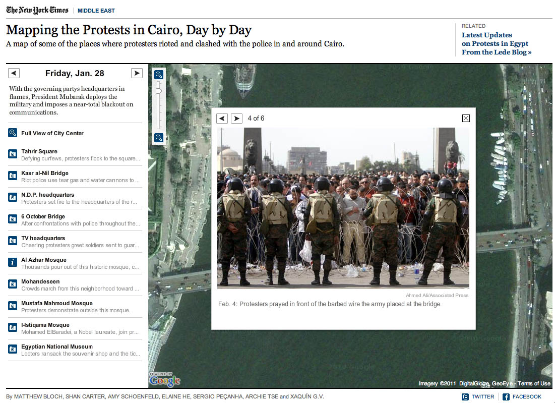
In this map, the New York Times has plotted the locations of the protests and clashes with police. There are also pictures, videos and contextual information provided in the icon info bubbles.
Al Jazeera - Mapping the Day of Wrath
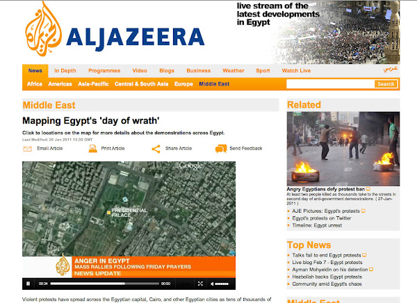
This website features a video illustrating the geographic spread of the protests using fly-over animations in Google Earth. The same webpage includes maps with information about protests in Cairo and throughout Egypt.
Hypercities Egypt
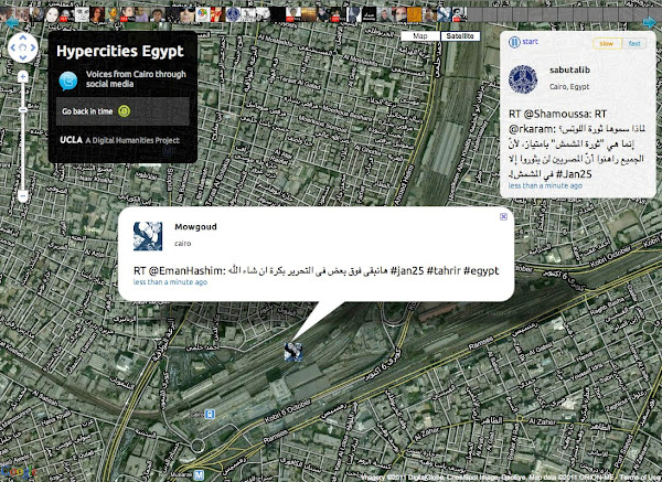
Twitter’s real-time updates have become an invaluable tool for the Egyptian protest organizers, observers and citizens looking to stay safe. Hypercities Egypt used Google Maps to display geolocated tweets as they came streaming in. Also, view another Egypt Twitter map created by MiBazaar.
GeoEye Tahrir Square Imagery
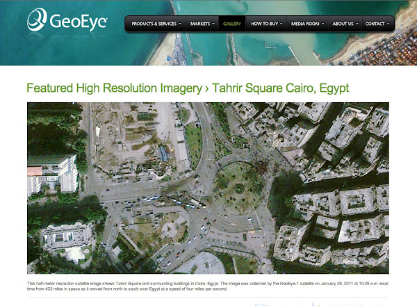
The imagery above is of Tahrir Square on January 29, 2011 at around 10:30am local time from more than 400 miles above. This imagery is exclusively viewable in Google Earth (and the Earth API) using thehistorical imagery tool. The imagery highlights GeoEye's stunning ability to respond to world events and capture timely imagery.
Egypt Protests in Google My Maps by Storyful.com
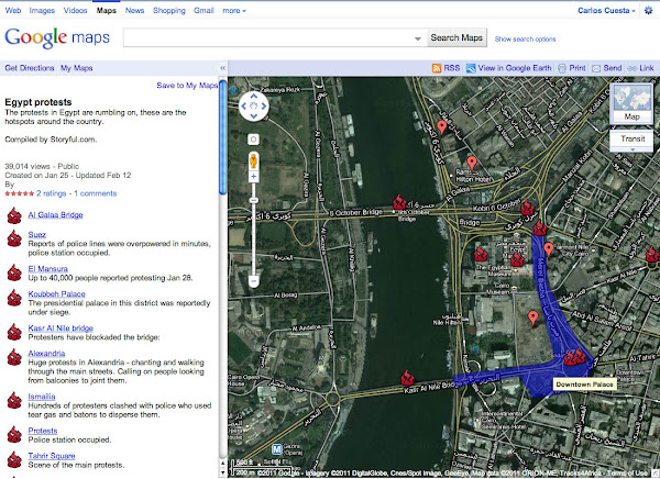
During the crisis, many Geo developers and persons without a Geo developer background collaborated on Google My Maps to chronicle the events geographically as they unfolded, such as this one by Storyful. Using the My Maps tool, anyone with access to Google Maps could create a collaborative mash-up with custom icons, colored polygons, content rich info-bubbles and many other features. Once completed, the map can be shared globally through My Maps or embedded on a website. Access can also be restricted to a select group of people if need be. Learn more at http://maps.google.com/getmaps.
-----------
How you can help: During a crisis situation, up-to-date maps are often crucial for organizing humanitarian aid and effective response. In many regions, however, accurate and local map data is sparse, out of date, or not available at all. You can add your geographic knowledge to Google Maps by contributing map edits in Google Map Maker, which is currently available in select countries and territories.
-----------
Posted by Carlos Cuesta, Geo APIs Product Marketing Manager
Google Maps JavaScript API: A Year in Retrospect
At Google I/O last May we graduated Maps JavaScript API V3. Since then, we have been working hard to deliver regular new features and bug fixes. This post is just a quick recap of what happened in 2010.
We publish a comprehensive changelog of all updates made to the API. If you’d like to be notified when a new version is released and changelog updated, sign up to the V3 notify mailing list.
Here are some highlights of the Maps API for 2010:
- FusionTablesLayer: display and query geodata stored in Fusion Tables. Many thousands of markers can be rendered this way.
- Styled Maps: customize the visual display of your map, including changing the color scheme, and controlling the visibility of features and labels.
- Elevation: access elevation data, including depths of the ocean floor.
- Draggable Directions: users can now personalize routes provided by the Directions API.
- Marker Animations: markers can be dropped onto the map and bounced on demand as well as the old favorites like raise when dragged, and bounce when dropped. These animations can be controlled via the Animation class.
- StreetView and Custom StreetView: display panoramic 360° views from many roads around the world. Custom StreetView can be linked to Google-provided StreetView panoramas (e.g. to show interiors of buildings).
- Custom Map Types: display your own map imagery or not.
- Rectangles and Circles: decorate regions on the map.
- Traffic and Bicycling Layers: display real-time traffic information and bicycle routes (where supported).
- KML and GeoRSS Layers: render on-demand layers, providing scalable rendering of KML and GeoRSS.
- Route Optimization: find the best route to cover a given set of stops, for example when planning a delivery.
- Bada and BlackBerry 6 support: mobile device support now encompasses Bada and Blackberry 6 devices such as the Samsung Wave and Blackberry Torch.
- StreetViewService: programmatically determine the availability of Street View data.
- MaxZoomService: find the highest zoom level for satellite imagery at a particular location.
There are also a few new utility libraries for the V3 API:
- MarkerClusterer V3 allows visual clustering of many markers. The latest version has improved performance and clustering accuracy.
- InfoBubble provides a customizable CSS3 tabbed info window.
- RichMarker allows you to put arbitrary HTML on a map and interact with it as if it were a marker.
- RouteBoxer generates a set of LatLngBounds that are guaranteed to cover every point within a specified distance of a path.
Also check out our Maps API articles, which cover topics that suit the accomplished Maps JavaScript API developer. We’ve added a few articles recently:
- Too Many Markers
- Election Ratings and Spatial Data with Fusion Tables
- Fun with MVC Objects
- Geocoding Strategies
Finally, we’d like to thank all the developers who use our API, post on the forums and file bug reports and feature requests. We’re excited for what lies ahead in 2011 and as always we are enthusiastic about enabling developers to deliver great mapping solutions.
Posted by Luke Mahe and Chris Broadfoot, Google Maps API team
Monetize your Maps API v3 application with AdSense for Maps
Many existing websites that use the Google Maps API also use Google AdSense to monetize their site. AdSense uses the content of pages to determine the best ads to show for that audience. However there is valuable additional context offered by the location of the map. When a map is centered on the Napa Valley for example, ads relating to wineries may be more relevant.
In response to this we are happy to bring AdSense for Maps to Maps API v3. The Maps Ad Unit overlays a set of AdSense ads on the map, in any of the supported formats. You can control where on the map the ads are placed, and the ads shown are based on the current map location. It is a simple way to monetize your maps with unintrusive and relevant advertising.
To use the Maps Ad Unit you must have an AdSense account that is enabled for AdSense for Content. If you do not have an AdSense account, you will need to sign up by filling in this form. Once you have received your AdSense publisher id, take a look at the documentation to see how to add the Maps Ad Unit to your Maps API application. As always if you have any questions or need help, we recommend posting to the Maps API v3 forum.
You may also notice that we’ve given the map type control and Google logo a refresh in this release. The new map type control is more compact and extensible, easier to use on touch screen devices, and consistent in look and feel with our other controls. We hope you like it!
Posted by Thor Mitchell, Maps API Product Manager
Julia meets HTML 5
[Cross posted from the Google Research blog]
Today, we launched Julia Map on Google Labs, a fractal renderer in HTML 5. Julia sets are fractals that were studied by the French mathematician Gaston Julia in the early 1920s. Fifty years later, Benoît Mandelbrot studied the set z2 − c and popularized it by generating the first computer visualisation. Generating these images requires heavy computation resources. Modern browsers have optimized JavaScript execution up to the point where it is now possible to render in a browser fractals like Julia sets almost instantly.
Julia Map uses the Google Maps API to zoom and pan into the fractals. The images are computed withHTML 5 canvas. Each image generally requires millions of floating point operations. Web workers spread the heavy calculations on all cores of the machine.
We hope you will enjoy exploring the different Julia sets, and share the URLs of the most artistic images you discovered. See what others have posted on Twitter under hashtag #juliamap. Click on the images below to dive in to infinity! (Supported on Chrome 8, Firefox 3.6, Safari 5 and above).
Posted by Daniel Wolf, Software Engineer


5 Great Ad Campaigns + Maps
The Google Maps API has always been a great way to visualize data, but recently more and more advertising agencies are realizing the potential that the Maps API has for creative and engaging product campaigns.
Whether it’s automobiles, zombie trains, a blockbuster action movie, a board game, or even a bathroom cleaning product, there’s a map application for that product and it is changing the face of interactive advertising.
Domestos Flush Tracker

Domestos is a brand of bleach sold in the UK, South Africa, and Poland. As an advertising campaign for this bathroom product, Domestos created a “Flush Tracker” that lets you track where your flush goes after it leaves your house and enters the local sewer system. The animated line on the map simulates the speed at which refuse moves the through sewer system.
A-Team - Drive the A-Team Van
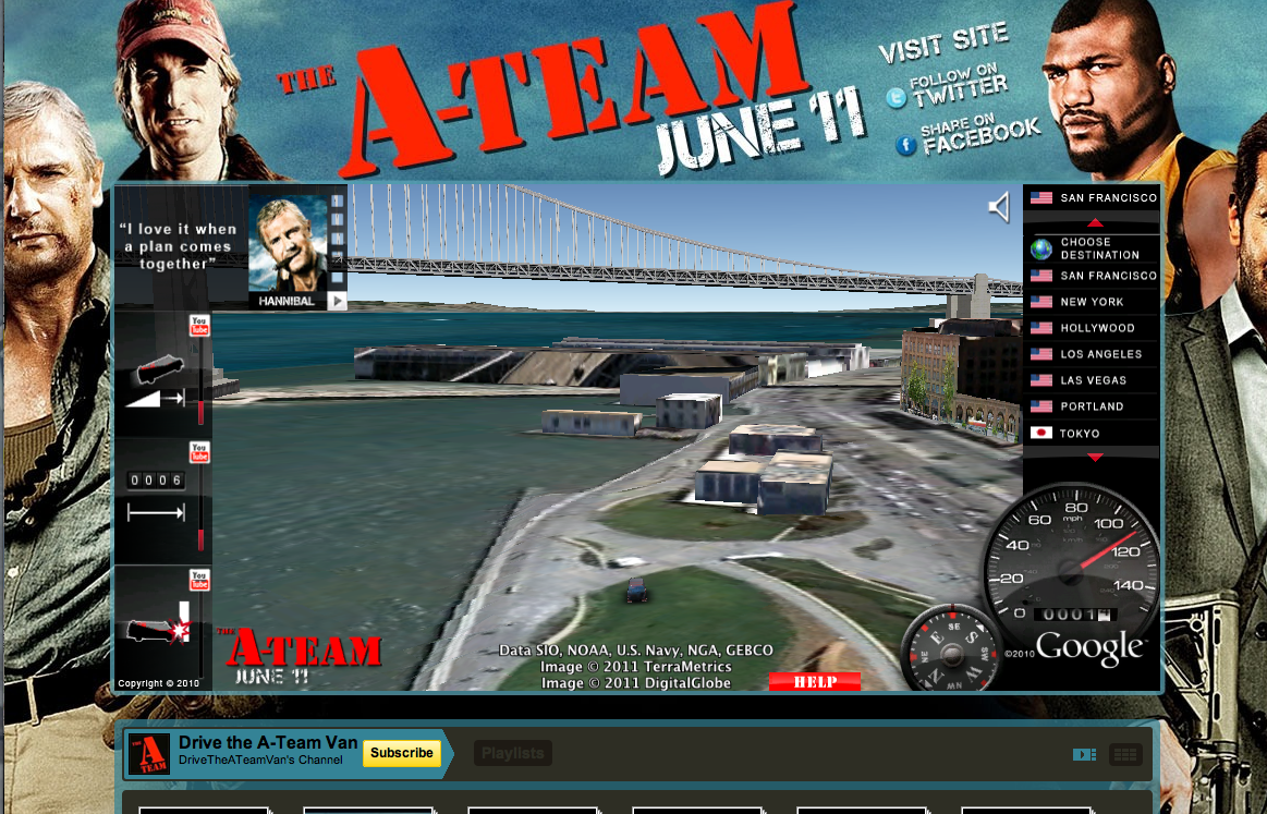
Nothing is more iconic of the A-Team than Mr. T’s van. Using the Earth API, users can drive Mr. T’s van through 3D models of 15 international cities. This implementation was seamlessly embedded into a YouTube landing page for the movie, where users can watch special movie clips that are unlocked by completing certain driving stunts.
Virgin Trains - Don’t Go Zombie...

From Virgin Trains, “The streets have been taken over by frustrated car-driving zombies who need to be saved. They have to get to the comfort of a Virgin Train and only you can help them with your special ticket machine. Follow the Map to get to your destination, saving zombies on the way.”
Alfa Romeo - Virtual Ownership

Using the Street View API, users can plug in their address and virtually place an Alfa Romeo Giulietta in their driveway. The size, color, and positioning of the vehicle can also be manipulated, creating the perfect postcard to share on Facebook, Twitter, or email to a friend.
Monopoly City Streets

Although no longer live, this highly addictive, global Google Maps version of Monopoly will always be remembered as a great advertising campaign. Users could buy any street in the world and build hotels, houses, stadiums, castles and skyscrapers (to name a few). Fortunately, this truly unique idea was well documented and you can view demos of the game on YouTube: http://goo.gl/p0aEh andhttp://goo.gl/uXx4k
Posted by Carlos Cuesta, Maps API Product Marketing Manager
A little help with spherical geometry from our first Maps API library
The Maps API v3 aims to minimise the time it takes to load and display the initial map. Indeed the architectural changes needed to reduce this delay on mobile devices were the primary motivation for the break from the Maps API v2. The biggest factor affecting load time is the size of the JavaScript, as both the speed at which this is downloaded, and the speed it is parsed before execution by browsers is directly related to its size.
As the Maps API v3 continues to evolve we are keen to add more features, but as we do so we must be mindful of the impact they have on the size of the API. In response to this constraint we are kicking off 2011 by introducing a new concept to the Maps API v3, called a library.
A library is a set of Maps API features that are only loaded when explicitly requested by the application. By packaging features into a library, we can deliver them to applications that need those features without penalising the loading times of applications that do not. A library has its own child namespace under google.maps, and is a fully supported component of the Maps API.
The first library that we are launching is the geometry library. The geometry library provides a set of utility functions for performing distance, heading, and area calculations in a spherical geometry, such as on the surface of the Earth, and also provides functions for handling encoded polylines. To use these functions in your Maps API application you must request the geometry library when loading the API:
<script type="text/javascript" src="http://maps.google.com/maps/api/js?libraries=geometry&sensor=true_or_false"></script>
For more information on the geometry library, see the Maps API Documentation and Reference. If you think of additional spherical geometry functions you would like to see added to the geometry library, please log a feature request on the Maps API Issue Tracker. If you have any questions about using the geometry library, the Maps API v3 Forum is a great place to find help.
Posted by Thor Mitchell, Maps API Product Manager
5 Great Chrome Web Store Apps + Maps
Last week we opened the Chrome Web Store, an online marketplace where users can discover thousands of web apps, extensions, and themes for Google Chrome. With millions of people already using Chrome, the Web Store is a great platform for developers to generate both exposure and revenue for their applications.
Many of these Chrome Apps are utilizing our Geo APIs. Here we’ve highlighted 5 great Chrome apps using Google Maps API.
 TripTrace
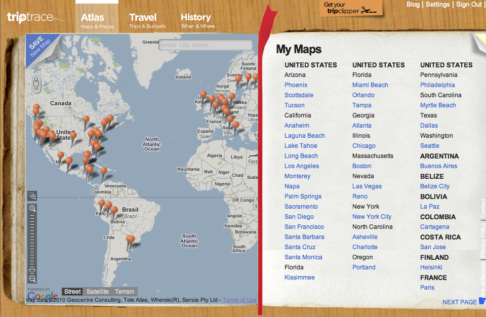
TripTrace organizes all the important places that you’ve been to or think you might want to visit; perfect for local exploration or vacation planning. Photos, events, and news are merged with your personal address book, check-ins, bookmarked web pages and more.
 Wikihood
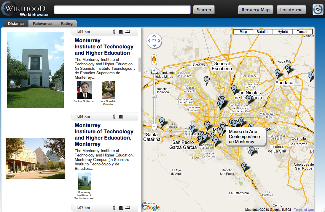
Wikihood World Browser gives users with a unique way to browse and discover knowledge. By organizing Wikipedia articles geographically, users can quickly find information about a given location on the map. Wikihood makes browsing even easier by providing a short synopsis of an article on the left side when the article’s geolocation is selected on the map.
 Breadcrumbs
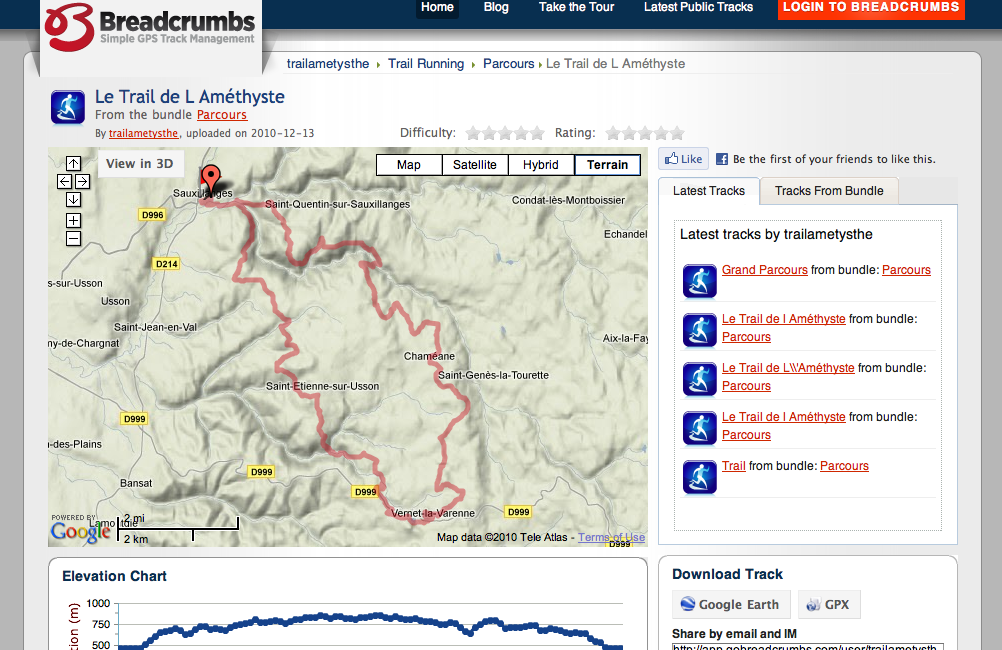
Breadcrumbs is a great GPS management tool. Users can visualize, organize, edit, and share GPS data collected from any GPS enabled device (including Android devices!). Breadcrumbs is also integrated with the Google Earth API for 3D visualizations.
 Delta Embark

Whether you’re planning your next vacation, trying to find a restaurant on your next business trip, or just looking for some travel inspiration this Chrome optimized travel guide is a delight to use. Travel planning made fun and easy, brought to you by Delta Airlines!
 Weatherbug

Don’t be late to Grandma’s this holiday season! Weatherbug let’s you view your weather and get the latest local current conditions, forecast, traffic information, and more for thousands of locations around the world.
To learn more about adding your apps to the Chrome Web Store, check out our developer documentation about apps and the store.
Posted by Carlos Cuesta, Maps API Product Marketing Manager
Hurricane Visualization using KML
In today’s guest blog post, Greg Gould of Geodesic Development) talks about how he created a unique Google Earth Hurricane Visualization using a custom .NET application to turn NOAA storm track data into a visually exciting KML animation of the 2010 hurricane season.
Geodesic Development was formed after several years of nights and weekends working on code and custom applications specifically designed to generate KML for Google Earth visualizations. Fascinated with the potential for developing new presentations in the 3D world of Google Earth, I’m focused on the “non-traditional” areas and visualizations which aren’t seen often or at all in Google Earth, especially in the main stream media. I hope that our visualizations will affect people’s perceptions of what’s possible in Google Earth.
I decided to create a Google Earth hurricane visualization to test ideas and explore the creative possibilities of animating ground overlays in ways I had not seen before in Google Earth. Hurricane data is readily available in KML from many different sources, but the static track lines and colored icons don’t present the storms in a visually exciting or dynamic way. I thought it was a perfect opportunity to develop an application to take seemingly unexciting data and highlight some new possibilities for presenting it with Google Earth.
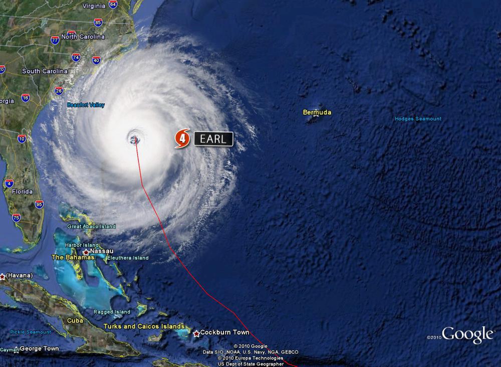
The application I developed uses a custom .NET class library to handle the calculations, data processing, and KML text generation for each storm track, which was obtained from the National Oceanic and Atmospheric Association's (NOAA) National Hurricane Center website. Each storm data file is processed and exported to its own KML file and combined to visualize the entire season. It’s really a cool way to see how the storms developed and the track each one took for one of the busiest seasons on record.
Currently, NOAA provides storm track data in several formats, i.e. Shapefiles, XML, and DBF. For this application the DBF data is manually downloaded as a separate file which contains all the feature information needed to create the KML animation. This file is processed locally as a simple database table with known storm data for each track point, e.g. Name, Dates, Intensity, Category, and Position. These data points will determine which overlay to use and how it gets displayed.
Because this data inherently contains varied amounts of time (from 3 hours to as many as 72) and distance between track points, I had to control the display and transitions of the overlays with a series of loops which interpolate position, heading and rotation to fill in points between each segment of track data. This was an important step for creating a smoother animation and seamless overlay changes. I then use a pre-defined set of overlays, size settings, spin rates, and track icons to create a consistent look and feel for the whole presentation when animating the different layers and files together.
There were definitely some issues with creating a complex visualization like this, having it run smoothly, and all without overwhelming the cache in Google Earth. It took several iterations to find a good compromise between smooth animation and too many overlays (since <GroundOverlay> elements don’t contain the Track element). I think the bigger challenge was to coordinate the overlays, transitions, and track icons with the frequently changing storm data, and get them all to play nice together.
I learned a lot from this project and I think it demonstrates some new possibilities for interesting visualizations that are not typically seen in Google Earth. I hope you like this one, it was fun doing it and hopefully we’ll have some more to show off soon.
Posted by Greg Gould of Geodesic Development


![[Valid RSS]](valid-rss-rogers.png "Validate my RSS feed")


